
This recipe provides a complete, lightweight vanilla JavaScript, HTML, and CSS solution to handle interactive form validation.
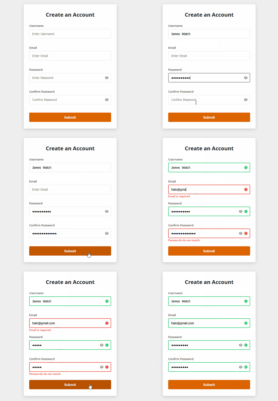
It validates user inputs such as usernames, emails, and passwords, checks character length limits, ensures password confirmation matches, and features toggleable eye icons for viewing hidden passwords securely.
<!DOCTYPE html>
<html lang="en">
  <head>
    <meta charset="UTF-8" />
    <meta name="viewport" content="width=device-width, initial-scale=1.0" />
    <title>Form Validation Tutorial</title>
    <!-- FontAwesome CDN for eye icons and validation check/error icons -->
    <link
      rel="stylesheet"
      href="https://cdnjs.cloudflare.com/ajax/libs/font-awesome/6.4.0/css/all.min.css"
    />
    <link rel="stylesheet" href="styles.css" />
  </head>
  <body>
    <section class="main">
      <div class="container box">
        <!-- Registration Form -->
        <form action="" id="form">
          <h2>Create an Account</h2>

          <!-- Username Field -->
          <div class="form-control">
            <label for="username">Username</label>
            <div class="input-box">
              <input type="text" id="username" placeholder="Enter Username" />
              <i class="fas fa-check-circle check-icon"></i>
              <i class="fas fa-exclamation-circle error-icon"></i>
            </div>
            <small>Error Message</small>
          </div>

          <!-- Email Field -->
          <div class="form-control">
            <label for="email">Email</label>
            <div class="input-box">
              <input type="text" id="email" placeholder="Enter Email" />
              <i class="fas fa-check-circle check-icon"></i>
              <i class="fas fa-exclamation-circle error-icon"></i>
            </div>
            <small>Error Message</small>
          </div>

          <!-- Password Field -->
          <div class="form-control">
            <label for="password">Password</label>
            <div class="input-box">
              <input type="password" id="password" placeholder="Enter Password" />
              <i class="fas fa-eye toggle-password" id="togglePassword"></i>
              <i class="fas fa-check-circle check-icon"></i>
              <i class="fas fa-exclamation-circle error-icon"></i>
            </div>
            <small>Error Message</small>
          </div>

          <!-- Confirm Password Field -->
          <div class="form-control">
            <label for="password2">Confirm Password</label>
            <div class="input-box">
              <input
                type="password"
                id="password2"
                placeholder="Confirm Password"
              />
              <i class="fas fa-eye toggle-password" id="togglePassword2"></i>
              <i class="fas fa-check-circle check-icon"></i>
              <i class="fas fa-exclamation-circle error-icon"></i>
            </div>
            <small>Error Message</small>
          </div>

          <!-- Submit Button -->
          <button type="submit">Submit</button>
        </form>
      </div>
    </section>
    <script src="script.js"></script>
  </body>
</html>@import url("https://fonts.googleapis.com/css2?family=Open+Sans:wght@300;400;600;700&display=swap");
/* CSS Root Variables for Color Schemes */
:root {
--white: #fff;
--black: #1c2b2d;
--blue: #31326f;
--light-blue: #005490;
--color-primary: #9d0191;
--color-sec: #db6400;
--grey: #eee;
--dark-grey: #222831;
}
/* Global Reset */
* {
margin: 0;
padding: 0;
box-sizing: border-box;
}
html {
font-size: 10px; /* Base size for rem calculations (1rem = 10px) */
}
body {
font-family: "Open Sans", sans-serif;
}
p {
font-size: 1.6rem;
line-height: 1.5;
}
/* Main Layout Centering Container */
.main {
height: 100vh;
background-color: var(--grey);
display: flex;
justify-content: center;
align-items: center;
}
/* Card Box Styling */
.box {
background-color: var(--white);
border-radius: 6px;
box-shadow: 0 4px 15px rgba(0, 0, 0, 0.15);
width: 42rem;
}
form {
padding: 3rem 2.5rem;
}
form h2 {
font-size: 2.4rem;
text-align: center;
margin-bottom: 2.5rem;
color: var(--dark-grey);
}
/* Form Control Grouping */
.form-control {
margin-bottom: 1.2rem;
padding-bottom: 2rem;
position: relative;
}
.form-control label {
display: block;
margin-bottom: 6px;
color: #555;
font-size: 1.3rem;
font-weight: 600;
}
/* Input Box Wrapper for Relative Icon Positioning */
.input-box {
position: relative;
display: flex;
align-items: center;
}
/* Input Fields Styling */
.form-control input {
display: block;
border: 2px solid var(--grey);
border-radius: 4px;
width: 100%;
padding: 1.1rem 3.5rem 1.1rem 1.2rem;
font-size: 1.4rem;
outline: none;
transition: border-color 0.2s ease;
}
.form-control input:focus {
border-color: #888;
}
/* Dynamic State Borders */
.form-control.success input {
border-color: #2ecc71;
}
.form-control.error input {
border-color: #e74c3c;
}
/* Icons Inside Input */
.input-box i {
position: absolute;
right: 1.2rem;
font-size: 1.4rem;
visibility: hidden;
}
/* Show/Hide Password Toggle Eye Icon */
.input-box .toggle-password {
visibility: visible;
color: #888;
cursor: pointer;
transition: color 0.2s;
}
.input-box .toggle-password:hover {
color: var(--dark-grey);
}
/* Success & Error State Visibility */
.form-control.success .check-icon {
visibility: visible;
color: #2ecc71;
}
.form-control.error .error-icon {
visibility: visible;
color: #e74c3c;
}
/* Adjust eye icon position when validation icons appear */
.form-control.success .toggle-password,
.form-control.error .toggle-password {
right: 3.5rem;
}
/* Error Message Feedback Small Text */
.form-control small {
color: #e74c3c;
position: absolute;
bottom: 0.2rem;
left: 0;
font-size: 1.2rem;
visibility: hidden;
font-weight: 600;
}
.form-control.error small {
visibility: visible;
}
/* Submit Button Styling */
form button {
width: 100%;
background-color: var(--color-sec);
border: none;
outline: none;
color: var(--white);
padding: 1.2rem;
font-size: 1.5rem;
font-weight: 600;
margin-top: 0.5rem;
border-radius: 4px;
cursor: pointer;
transition: background-color 0.2s ease;
}
form button:hover {
background-color: #b85200;
}// DOM Element Selections
const form = document.getElementById("form"),
username = document.getElementById("username"),
email = document.getElementById("email"),
password = document.getElementById("password"),
password2 = document.getElementById("password2"),
togglePassword = document.getElementById("togglePassword"),
togglePassword2 = document.getElementById("togglePassword2");
/**
* Event Listener: Toggle Password Visibility (Show/Hide)
* Switches the input type between 'password' and 'text' and toggles the eye icon.
*/
togglePassword.addEventListener("click", () => {
const type = password.getAttribute("type") === "password" ? "text" : "password";
password.setAttribute("type", type);
togglePassword.classList.toggle("fa-eye-slash");
});
togglePassword2.addEventListener("click", () => {
const type = password2.getAttribute("type") === "password" ? "text" : "password";
password2.setAttribute("type", type);
togglePassword2.classList.toggle("fa-eye-slash");
});
/**
* Form Submit Event Listener
* Triggers validation functions when the user clicks the Submit button.
*/
form.addEventListener("submit", (e) => {
e.preventDefault(); // Prevent page refresh on submit
checkRequired([username, email, password, password2]);
checkLength(username, 3, 15);
checkLength(password, 8, 20);
checkEmail(email);
matchPassword(password, password2);
});
/**
* Check Required Fields Function
* Loops through input array and checks if any field is empty.
*/
function checkRequired(inputAll) {
inputAll.forEach((input) => {
if (input.value.trim() === "") {
showError(input, `${getFieldName(input)} is required`);
} else {
showSuccess(input);
}
});
}
/**
* Check Input Length Function
* Validates whether the input length meets minimum and maximum requirements.
*/
function checkLength(input, min, max) {
if (input.value.trim() !== "") {
if (input.value.length < min) {
showError(
input,
`${getFieldName(input)} must be at least ${min} characters.`
);
} else if (input.value.length > max) {
showError(
input,
`${getFieldName(input)} must be less than ${max} characters.`
);
} else {
showSuccess(input);
}
}
}
/**
* Validate Email Function
* Uses Regular Expression (RegEx) to check valid email formatting.
*/
function checkEmail(input) {
const re = /^(([^<>()[\]\\.,;:\s@"]+(\.[^<>()[\]\\.,;:\s@"]+)*)|(".+"))@((\[[0-9]{1,3}\.[0-9]{1,3}\.[0-9]{1,3}\.[0-9]{1,3}\])|(([a-zA-Z\-0-9]+\.)+[a-zA-Z]{2,}))$/;
if (input.value.trim() !== "") {
if (re.test(input.value.trim())) {
showSuccess(input);
} else {
showError(input, "Email is not valid");
}
}
}
/**
* Check Password Match Function
* Compares password and confirmation password values.
*/
function matchPassword(input1, input2) {
if (input1.value.trim() !== "" && input2.value.trim() !== "") {
if (input1.value !== input2.value) {
showError(input2, "Passwords do not match");
}
}
}
/**
* Show Error State
* Changes class to 'error' on the container wrapper and updates error message text.
*/
function showError(input, message) {
const formControl = input.parentElement.parentElement;
formControl.className = "form-control error";
const small = formControl.querySelector("small");
small.innerText = message;
}
/**
* Show Success State
* Changes class to 'success' on the container wrapper to display green borders and checkmarks.
*/
function showSuccess(input) {
const formControl = input.parentElement.parentElement;
formControl.className = "form-control success";
}
/**
* Get Field Name Helper
* Capitalizes the first letter of the input ID to use dynamically in error messages.
*/
function getFieldName(input) {
return input.id.charAt(0).toUpperCase() + input.id.slice(1);
}How It Works
- DOM Element Selections: The script targets all necessary form fields, submit buttons, and toggle icons at initialization.
- Password Visibility Toggle: Clicking the eye icon dynamically switches the input field’s type attribute between
passwordandtextwhile toggling the FontAwesome eye-slash icon class. - Event Listener & Form Submissions: Intercepts the default form submission action (
e.preventDefault()) to run a series of validation checks sequentially without reloading the page. - Validation Logic Functions:
checkRequired(): Loops through designated inputs to verify they are not left blank.checkLength(): Evaluates if input lengths fall within specified minimum and maximum parameters.checkEmail(): Employs Regular Expressions (RegEx) to ensure structural email validity.matchPassword(): Confirms that the confirmation password matches the initial password input.
- Dynamic UI Feedback: Modifies parent wrapper CSS classes to either
.error(rendering red borders and warning messages) or.success(rendering green borders and validation checkmarks).
Important Customization Notes
- Character Length Constraints: You can modify the minimum and maximum limits inside
script.jswhen calling thecheckLength()function (e.g., changingcheckLength(username, 3, 15)to fit your specific database or schema requirements). - Styling & Color Palettes: All structural and visual themes are controlled via CSS variables in
styles.css. You can customize properties like--color-secor border colors to match your brand identity. - Backend Integration: Currently, the form stops submission via
e.preventDefault()for validation purposes. To connect this to a live server backend or API endpoint, replace or uncomment submission logic within the main event listener.