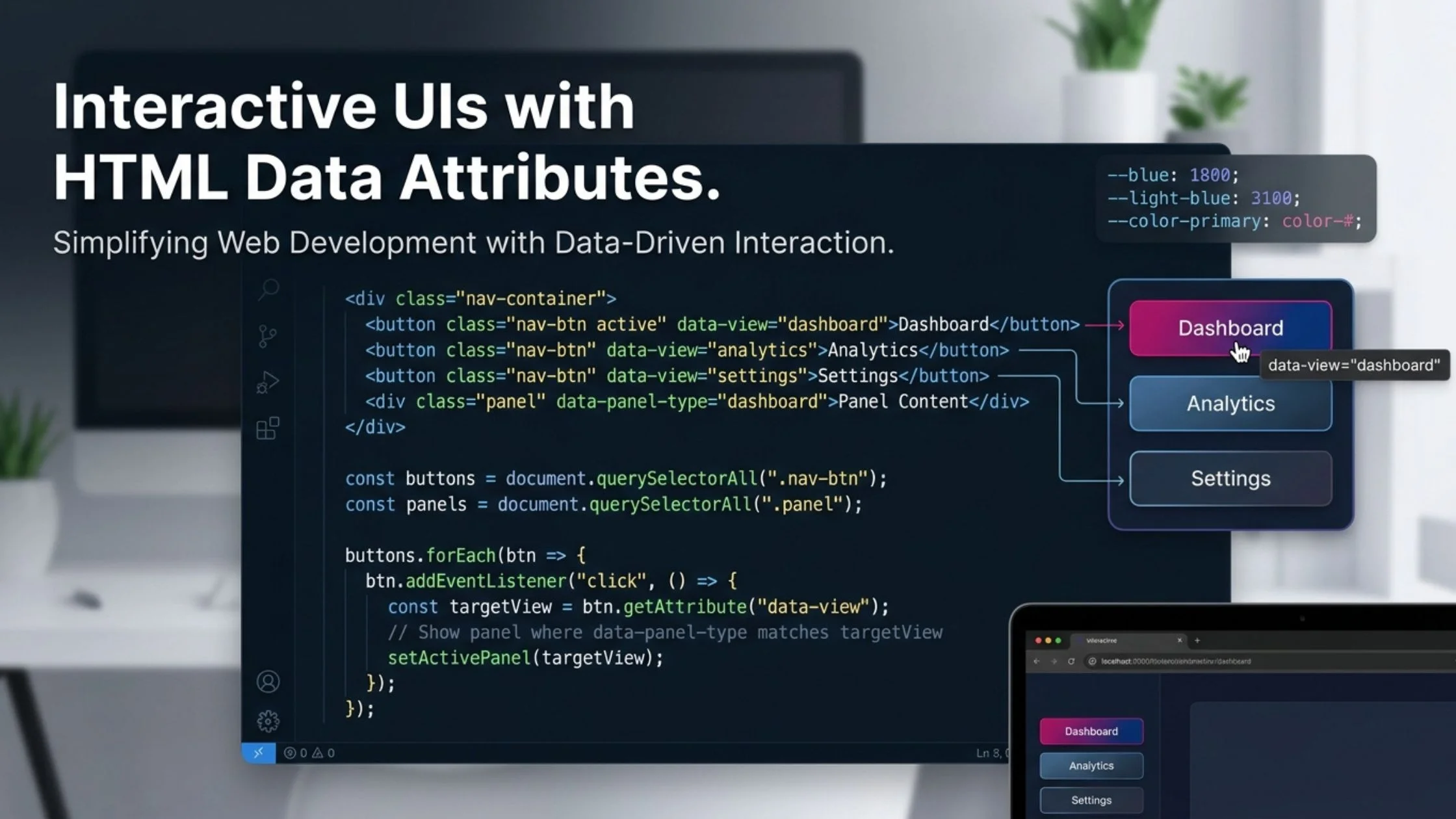
Want to change content dynamically without messy ID selectors or hardcoded event listeners for every single button?
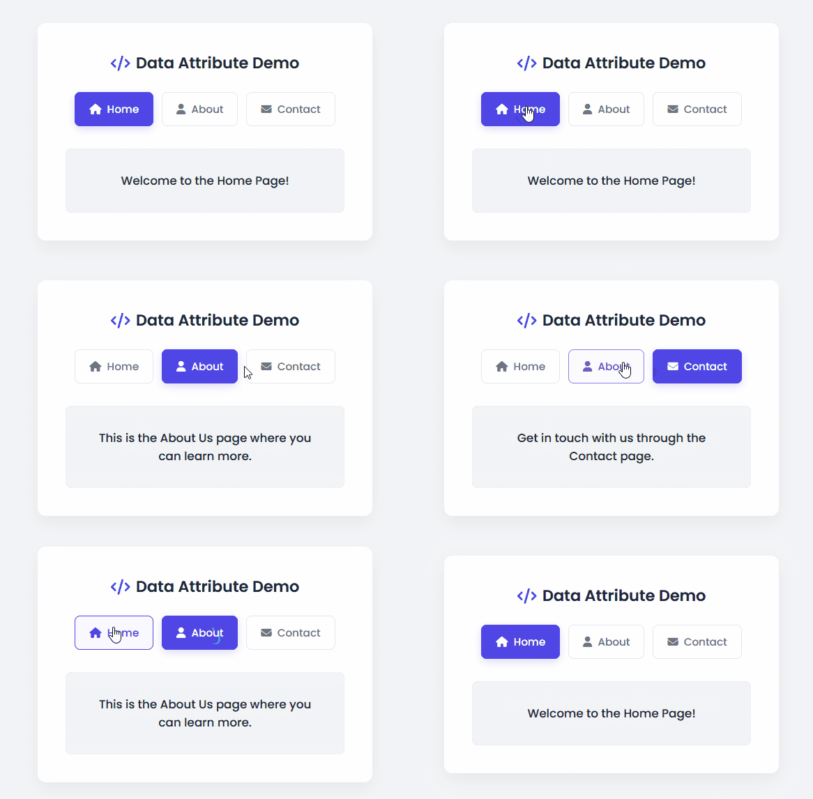
In this recipe, you will learn how to leverage HTML Data Attributes (data-*) alongside modern CSS and clean JavaScript to build a sleek, interactive content switcher component.
<!DOCTYPE html>
<html lang="en">
  <head>
    <meta charset="UTF-8" />
    <meta name="viewport" content="width=device-width, initial-scale=1.0" />
    <title>Data Attribute Tutorial</title>
    <!-- FontAwesome CDN for rendering clean modern UI icons -->
    <link
      rel="stylesheet"
      href="https://cdnjs.cloudflare.com/ajax/libs/font-awesome/6.4.0/css/all.min.css"
    />
    <!-- Link to external stylesheet -->
    <link rel="stylesheet" href="styles.css" />
  </head>
  <body>
    <!-- Main container card structuring the tutorial component layout -->
    <div class="tutorial-card">
      <h2><i class="fa-solid fa-code"></i> Data Attribute Demo</h2>

      <!-- Button group container utilizing HTML data attributes (data-link) for dynamic routing/filtering -->
      <div class="buttons">
        <button class="btn active" data-link="home">
          <i class="fa-solid fa-house"></i> Home
        </button>
        <button class="btn" data-link="about">
          <i class="fa-solid fa-user"></i> About
        </button>
        <button class="btn" data-link="contact">
          <i class="fa-solid fa-envelope"></i> Contact
        </button>
      </div>

      <!-- Content wrapper where text updates dynamically based on button clicks -->
      <div class="content-display">
        <p class="text">Welcome to the Home Page!</p>
      </div>
    </div>

    <!-- Link to external JavaScript logic file -->
    <script src="script.js"></script>
  </body>
</html>/* Import Google Font 'Poppins' for clean typography */
@import url("https://fonts.googleapis.com/css2?family=Poppins:wght@300;400;500;600&display=swap");
/* CSS Custom Properties (Design Tokens) for centralized theme styling */
:root {
--primary-color: #4f46e5;
--primary-hover: #4338ca;
--bg-color: #f3f4f6;
--card-bg: #ffffff;
--text-main: #1f2937;
--text-muted: #6b7280;
--border-color: #e5e7eb;
--radius: 12px;
--transition: all 0.3s ease;
}
/* Global Reset to eliminate browser default margins and paddings */
* {
margin: 0;
padding: 0;
box-sizing: border-box;
}
/* Center the layout vertically and horizontally on the viewport */
body {
font-family: "Poppins", sans-serif;
background-color: var(--bg-color);
color: var(--text-main);
display: flex;
justify-content: center;
align-items: center;
min-height: 100vh;
}
/* Card container styling */
.tutorial-card {
background-color: var(--card-bg);
padding: 2.5rem;
border-radius: var(--radius);
box-shadow: 0 10px 25px rgba(0, 0, 0, 0.05);
width: 100%;
max-width: 480px;
text-align: center;
}
/* Card title typography and layout */
.tutorial-card h2 {
font-size: 1.4rem;
font-weight: 600;
margin-bottom: 1.5rem;
color: var(--text-main);
display: flex;
align-items: center;
justify-content: center;
gap: 0.5rem;
}
.tutorial-card h2 i {
color: var(--primary-color);
}
/* Flexbox container for action buttons */
.buttons {
display: flex;
justify-content: center;
gap: 0.75rem;
margin-bottom: 2rem;
}
/* Base button appearance and transition states */
.btn {
background-color: transparent;
border: 1px solid var(--border-color);
padding: 0.75rem 1.25rem;
font-size: 0.95rem;
font-weight: 500;
font-family: inherit;
color: var(--text-muted);
border-radius: 8px;
cursor: pointer;
transition: var(--transition);
display: flex;
align-items: center;
gap: 0.5rem;
}
/* Hover feedback effect for buttons */
.btn:hover {
border-color: var(--primary-color);
color: var(--primary-color);
background-color: rgba(79, 70, 229, 0.04);
}
/* Active class state highlighting the currently selected option */
.btn.active {
background-color: var(--primary-color);
color: #ffffff;
border-color: var(--primary-color);
box-shadow: 0 4px 12px rgba(79, 70, 229, 0.2);
}
/* Content display box area */
.content-display {
background-color: var(--bg-color);
padding: 2rem;
border-radius: 8px;
border: 1px dashed var(--border-color);
}
/* Text style with opacity transition configuration */
.text {
font-size: 1.05rem;
font-weight: 500;
color: var(--text-main);
transition: opacity 0.2s ease-in-out;
}// Select all button elements and the target text container element from the DOM
const btns = document.querySelectorAll(".btn");
const text = document.querySelector(".text");
// Content dictionary mapping data attribute keys to respective display messages
const contentMap = {
home: "Welcome to the Home Page!",
about: "This is the About Us page where you can learn more.",
contact: "Get in touch with us through the Contact page."
};
// Loop through each button node to attach an event listener for click actions
btns.forEach((btn) => {
btn.addEventListener("click", (e) => {
// Extract the value from the 'data-link' attribute using the dataset property (e.g., 'home', 'about', 'contact')
const filter = e.currentTarget.dataset.link;
// 1. Handle Active State Toggle: Remove 'active' class from all buttons, then add it to the clicked button
btns.forEach((b) => b.classList.remove("active"));
e.currentTarget.classList.add("active");
// 2. Update Content Dynamically: Apply a smooth fade-out/fade-in effect when text content changes
if (contentMap[filter]) {
text.style.opacity = 0; // Fade out current text
setTimeout(() => {
text.textContent = contentMap[filter]; // Swap text value
text.style.opacity = 1; // Fade in new text
}, 150);
}
});
});How the Code Works
- HTML Structure (
index.html)Instead of writing separate event handlers for individual buttons, we embed custom data directly into the markup using thedata-linkattribute (data-link="home",data-link="about",data-link="contact"). This keeps the HTML semantic and extensible. - Styling & Transitions (
styles.css)The CSS utilizes CSS Custom Properties (design tokens) for a consistent theme, Flexbox for alignment, and a smoothopacitytransition class (.text) to ensure text updates feel polished rather than jarring. An.activestate clearly highlights the currently selected button. - JavaScript Logic (
script.js)- Event Delegation & Node Selection: The script loops through all
.btnelements usingquerySelectorAlland attaches aclicklistener to each. - Dataset Access: When clicked, it extracts the target identifier using
e.currentTarget.dataset.link. - State Management: It clears the
.activeclass from all buttons and applies it solely to the clicked element. - Content Mapping: A structured lookup object (
contentMap) pairs each data attribute key with its respective text string, updating the content dynamically with a clean fade effect.
- Event Delegation & Node Selection: The script loops through all
Customization Notes: Variables You Can Modify
You can easily adapt this template to fit your specific project needs by modifying these key areas:
- The Data Attribute Keys (
index.html):You can change or add new buttons by altering thedata-link="..."values (e.g., changinghometodashboard, or addingdata-link="services"). - The Content Dictionary (
script.js):To add more options or change text, update thecontentMapobject keys to match your HTML data attributes, and modify the string values:
const contentMap = {
  home: "Welcome to your new custom home text!",
  about: "Update your about description here.",
  contact: "Modify your contact information here.",
  services: "Add a new key-value pair for custom pages!" // Example extension
};- Theme Colors (
styles.css):Quickly change the primary brand color by editing the--primary-colorvariable inside the:rootblock:
:root {
  --primary-color: #4f46e5; /* Change this hex code to match your brand */
}