
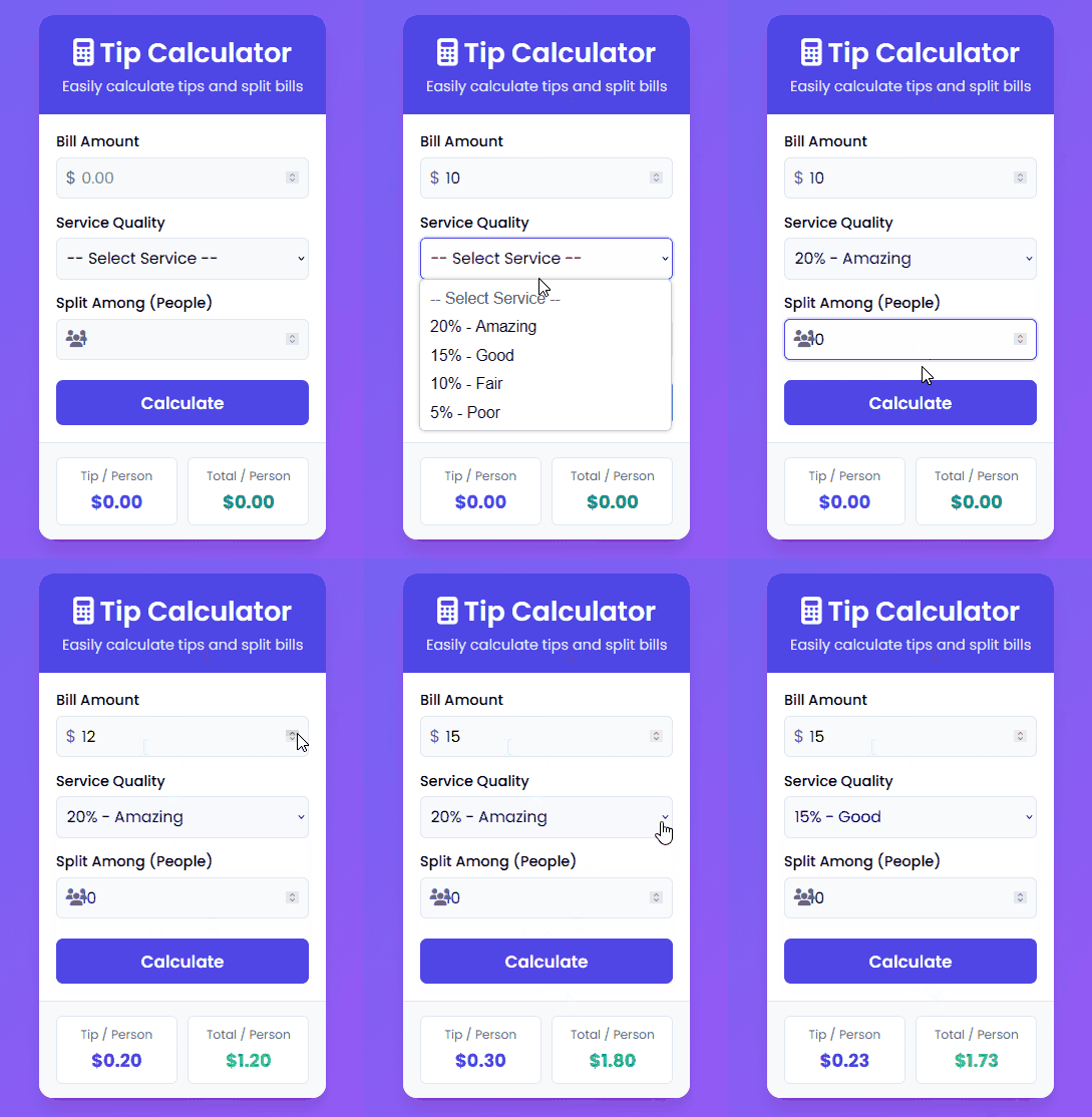
Welcome to another edition of the Code Cookbook! In this tutorial, we will break down how to create a modern, responsive, and user-friendly Tip Calculator web application from scratch.
<!DOCTYPE html>
<html lang="en">
  <head>
    <meta charset="UTF-8" />
    <meta name="viewport" content="width=device-width, initial-scale=1.0" />
    <title>Modern Tip Calculator</title>
    <!-- FontAwesome icons for UI enhancement -->
    <link
      rel="stylesheet"
      href="https://cdnjs.cloudflare.com/ajax/libs/font-awesome/6.4.0/css/all.min.css"
    />
    <link rel="stylesheet" href="styles.css" />
  </head>
  <body>
    <!-- Main wrapper to center the card on the screen -->
    <main class="wrapper">
      <div class="calculator-card">

        <!-- Card Header Section -->
        <div class="card-header">
          <h2><i class="fa-solid fa-calculator"></i> Tip Calculator</h2>
          <p>Easily calculate tips and split bills</p>
        </div>

        <!-- Calculator Form -->
        <form class="calculator-form" id="tip-form">

          <!-- Bill Input Group -->
          <div class="input-group">
            <label for="bill">Bill Amount</label>
            <div class="input-field">
              <span class="currency-symbol">$</span>
              <input type="number" id="bill" class="bill" placeholder="0.00" step="any" />
            </div>
          </div>

          <!-- Service Rate Dropdown -->
          <div class="input-group">
            <label for="rate">Service Quality</label>
            <select name="rate" id="rate" class="rate">
              <option disabled selected value="0">-- Select Service --</option>
              <option value="0.20">20% - Amazing</option>
              <option value="0.15">15% - Good</option>
              <option value="0.10">10% - Fair</option>
              <option value="0.05">5% - Poor</option>
            </select>
          </div>

          <!-- Split People Group -->
          <div class="input-group">
            <label for="split">Split Among (People)</label>
            <div class="input-field">
              <span class="currency-symbol"><i class="fa-solid fa-users"></i></span>
              <input type="number" id="split" class="split-input" value="1" min="1" />
            </div>
          </div>

          <!-- Calculate Button -->
          <button type="button" class="btn">Calculate</button>

          <!-- Error Message Notice -->
          <p class="error">Please enter a valid bill amount and select a service rate.</p>
        </form>

        <!-- Result Display Container -->
        <div class="result-container">
          <div class="result-box">
            <span class="result-label">Tip / Person</span>
            <span class="tip-amount tip">$0.00</span>
          </div>
          <div class="result-box total-box">
            <span class="result-label">Total / Person</span>
            <span class="total-amount total">$0.00</span>
          </div>
        </div>

      </div>
    </main>

    <script src="script.js"></script>
  </body>
</html>/* Import Google Fonts - Poppins */
@import url("https://fonts.googleapis.com/css2?family=Poppins:wght@300;400;500;600;700&display=swap");
/* Global CSS Variables for easy color management */
:root {
--primary: #4f46e5;
--primary-hover: #4338ca;
--accent: #f59e0b;
--bg-gradient: linear-gradient(135deg, #6366f1 0%, #a855f7 100%);
--white: #ffffff;
--text-dark: #1e293b;
--text-gray: #64748b;
--bg-light: #f8fafc;
--border-color: #e2e8f0;
--error-color: #ef4444;
}
/* Reset default browser margins, paddings, and box-sizing */
* {
margin: 0;
padding: 0;
box-sizing: border-box;
}
/* Body setup with full screen height and gradient background */
body {
font-family: "Poppins", sans-serif;
background: var(--bg-gradient);
min-height: 100vh;
display: flex;
justify-content: center;
align-items: center;
color: var(--text-dark);
}
/* Outer layout wrapper */
.wrapper {
width: 100%;
max-width: 450px;
padding: 20px;
}
/* Main glass/card container */
.calculator-card {
background-color: var(--white);
border-radius: 20px;
box-shadow: 0 20px 25px -5px rgba(0, 0, 0, 0.1), 0 10px 10px -5px rgba(0, 0, 0, 0.04);
overflow: hidden;
}
/* Card Header Styling */
.card-header {
background-color: var(--primary);
color: var(--white);
padding: 24px;
text-align: center;
}
.card-header h2 {
font-size: 2.4rem;
font-weight: 600;
margin-bottom: 4px;
}
.card-header p {
font-size: 1.3rem;
opacity: 0.85;
}
/* Form Padding & Layout */
.calculator-form {
padding: 24px;
}
.input-group {
margin-bottom: 18px;
}
.input-group label {
display: block;
font-size: 1.3rem;
font-weight: 500;
margin-bottom: 6px;
color: var(--text-dark);
}
/* Input Wrapper for Icon/Symbol positioning */
.input-field {
position: relative;
display: flex;
align-items: center;
}
.currency-symbol {
position: absolute;
left: 14px;
color: var(--text-gray);
font-size: 1.5rem;
}
/* Input Fields and Select Dropdown Styling */
input,
select {
width: 100%;
padding: 12px 14px 12px 35px;
font-family: "Poppins", sans-serif;
font-size: 1.4rem;
border: 1.5px solid var(--border-color);
border-radius: 10px;
outline: none;
background-color: var(--bg-light);
transition: all 0.3s ease;
color: var(--text-dark);
}
select {
padding-left: 14px;
cursor: pointer;
}
.input-field input {
padding-left: 35px;
}
/* Focus state for inputs and selects */
input:focus,
select:focus {
border-color: var(--primary);
background-color: var(--white);
box-shadow: 0 0 0 3px rgba(79, 70, 229, 0.15);
}
/* Action Button Styling */
.btn {
width: 100%;
padding: 14px;
background-color: var(--primary);
color: var(--white);
font-family: "Poppins", sans-serif;
font-size: 1.5rem;
font-weight: 600;
border: none;
border-radius: 10px;
cursor: pointer;
transition: background-color 0.3s ease, transform 0.1s ease;
margin-top: 10px;
}
.btn:hover {
background-color: var(--primary-hover);
}
.btn:active {
transform: scale(0.98);
}
/* Error message styling (hidden by default) */
.error {
color: var(--error-color);
font-size: 1.2rem;
text-align: center;
margin-top: 12px;
display: none;
font-weight: 500;
}
/* Result Section Container */
.result-container {
background-color: var(--bg-light);
padding: 20px 24px;
border-top: 1px solid var(--border-color);
display: flex;
gap: 15px;
}
/* Individual Result Box */
.result-box {
flex: 1;
background: var(--white);
padding: 12px;
border-radius: 10px;
border: 1px solid var(--border-color);
text-align: center;
}
.result-label {
display: block;
font-size: 1.1rem;
color: var(--text-gray);
margin-bottom: 4px;
}
.result-box span:last-child {
font-size: 1.6rem;
font-weight: 700;
color: var(--primary);
}
.total-box span:last-child {
color: #10b981;
}/* Import Google Fonts - Poppins */
@import url("https://fonts.googleapis.com/css2?family=Poppins:wght@300;400;500;600;700&display=swap");
/* Global CSS Variables for easy color management */
:root {
--primary: #4f46e5;
--primary-hover: #4338ca;
--accent: #f59e0b;
--bg-gradient: linear-gradient(135deg, #6366f1 0%, #a855f7 100%);
--white: #ffffff;
--text-dark: #1e293b;
--text-gray: #64748b;
--bg-light: #f8fafc;
--border-color: #e2e8f0;
--error-color: #ef4444;
}
/* Reset default browser margins, paddings, and box-sizing */
* {
margin: 0;
padding: 0;
box-sizing: border-box;
}
/* Body setup with full screen height and gradient background */
body {
font-family: "Poppins", sans-serif;
background: var(--bg-gradient);
min-height: 100vh;
display: flex;
justify-content: center;
align-items: center;
color: var(--text-dark);
}
/* Outer layout wrapper */
.wrapper {
width: 100%;
max-width: 450px;
padding: 20px;
}
/* Main glass/card container */
.calculator-card {
background-color: var(--white);
border-radius: 20px;
box-shadow: 0 20px 25px -5px rgba(0, 0, 0, 0.1), 0 10px 10px -5px rgba(0, 0, 0, 0.04);
overflow: hidden;
}
/* Card Header Styling */
.card-header {
background-color: var(--primary);
color: var(--white);
padding: 24px;
text-align: center;
}
.card-header h2 {
font-size: 2.4rem;
font-weight: 600;
margin-bottom: 4px;
}
.card-header p {
font-size: 1.3rem;
opacity: 0.85;
}
/* Form Padding & Layout */
.calculator-form {
padding: 24px;
}
.input-group {
margin-bottom: 18px;
}
.input-group label {
display: block;
font-size: 1.3rem;
font-weight: 500;
margin-bottom: 6px;
color: var(--text-dark);
}
/* Input Wrapper for Icon/Symbol positioning */
.input-field {
position: relative;
display: flex;
align-items: center;
}
.currency-symbol {
position: absolute;
left: 14px;
color: var(--text-gray);
font-size: 1.5rem;
}
/* Input Fields and Select Dropdown Styling */
input,
select {
width: 100%;
padding: 12px 14px 12px 35px;
font-family: "Poppins", sans-serif;
font-size: 1.4rem;
border: 1.5px solid var(--border-color);
border-radius: 10px;
outline: none;
background-color: var(--bg-light);
transition: all 0.3s ease;
color: var(--text-dark);
}
select {
padding-left: 14px;
cursor: pointer;
}
.input-field input {
padding-left: 35px;
}
/* Focus state for inputs and selects */
input:focus,
select:focus {
border-color: var(--primary);
background-color: var(--white);
box-shadow: 0 0 0 3px rgba(79, 70, 229, 0.15);
}
/* Action Button Styling */
.btn {
width: 100%;
padding: 14px;
background-color: var(--primary);
color: var(--white);
font-family: "Poppins", sans-serif;
font-size: 1.5rem;
font-weight: 600;
border: none;
border-radius: 10px;
cursor: pointer;
transition: background-color 0.3s ease, transform 0.1s ease;
margin-top: 10px;
}
.btn:hover {
background-color: var(--primary-hover);
}
.btn:active {
transform: scale(0.98);
}
/* Error message styling (hidden by default) */
.error {
color: var(--error-color);
font-size: 1.2rem;
text-align: center;
margin-top: 12px;
display: none;
font-weight: 500;
}
/* Result Section Container */
.result-container {
background-color: var(--bg-light);
padding: 20px 24px;
border-top: 1px solid var(--border-color);
display: flex;
gap: 15px;
}
/* Individual Result Box */
.result-box {
flex: 1;
background: var(--white);
padding: 12px;
border-radius: 10px;
border: 1px solid var(--border-color);
text-align: center;
}
.result-label {
display: block;
font-size: 1.1rem;
color: var(--text-gray);
margin-bottom: 4px;
}
.result-box span:last-child {
font-size: 1.6rem;
font-weight: 700;
color: var(--primary);
}
.total-box span:last-child {
color: #10b981;
}How the Code Works
This project is split into three core layers that work seamlessly together:
- HTML Structure (
index.html): Sets up the semantic layout, including an outer wrapper card, input fields for the bill amount and number of guests to split the bill with, a dropdown menu for service quality ratings, and dedicated containers to display the final calculated tip and total per person. HTML - CSS Styling (
styles.css): Implements a clean, modern aesthetic using Google Fonts (Poppins), CSS root variables for easy color management, responsive Flexbox alignment, and smooth interactive states for form controls and buttons. CSS - JavaScript Logic (
script.js): Manages user interaction and business logic. It listens for button clicks, validates user inputs to catch errors or missing fields, computes the tip and split totals, and dynamically updates the DOM with formatted currency values. JS
Cookbook Notes: Customizable Variables & Settings
If you want to tweak or expand this project for your own portfolio or blog tutorial, here are the key variables and elements you can easily customize:
- Service Rate Options (
index.html): You can modify the percentage values or add new options inside the<select>dropdown element. For example, changingvalue="0.20"to your preferred tipping tiers. HTML - Color Theme (
styles.css): Locate the:rootselector at the top of the stylesheet. Changing the--primaryvariable hex code will instantly update the theme color of the header, buttons, and focus states across the entire app. CSS - Default Split Count (
index.html): The split input field defaults to1person (value="1"). You can change this baseline if you want a different default starting group size. HTML