
Accordions are an essential UI ingredient for modern web applications. They allow you to organize large amounts of information—like FAQs, documentation, or product specs—into compact, expandable sections.
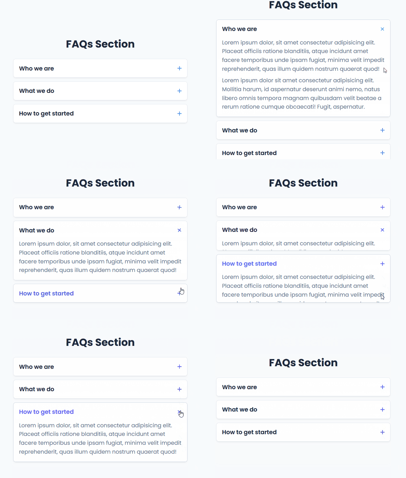
In this recipe, we’ll build a sleek, accessible, and fully responsive accordion component using plain JavaScript, HTML, and modern CSS.
🍽️ The Ingredients (How It Works)
Building a smooth accordion comes down to three key parts working seamlessly together:
- Semantic HTML Structure: Each item consists of an accordion card containing an
<button>header and a content container (.accordion-collapse). Using a button ensures proper keyboard navigation and accessibility out of the box. - Smooth Height Transitions in CSS: The content area is kept hidden by setting
max-height: 0andoverflow: hidden. When activated, JS calculates the content’s exact height and updates themax-height, creating a fluid expansion animation. - Exclusive Toggle Logic in JavaScript: When a user clicks a section header, the script closes any currently open sections by resetting their
max-heightand active states, then expands the newly selected item.
🛠️ Complete Code Solution
<!DOCTYPE html>
<html lang="en">
  <head>
    <meta charset="UTF-8" />
    <meta name="viewport" content="width=device-width, initial-scale=1.0" />
    <title>Modern Accordion Tutorial</title>
    <!-- Font Awesome CDN for icons -->
    <link
      rel="stylesheet"
      href="https://cdnjs.cloudflare.com/ajax/libs/font-awesome/6.4.0/css/all.min.css"
    />
    <link rel="stylesheet" href="styles.css" />
  </head>
  <body>
    <!-- Main FAQ Section Container -->
    <section class="faq-section">
      <div class="container">
        <h1>FAQs Section</h1>

        <div class="accordion-container">
          <!-- Accordion Item 1 -->
          <div class="accordion-item">
            <button class="accordion-header">
              <span>Who we are</span>
              <i class="fa-solid fa-plus icon"></i>
            </button>
            <div class="accordion-collapse">
              <div class="accordion-body">
                <p>
                  Lorem ipsum dolor, sit amet consectetur adipisicing elit. Placeat
                  officiis ratione blanditiis, atque incidunt amet facere temporibus
                  unde ipsam fugiat, minima velit impedit reprehenderit, quas illum
                  quidem nostrum quaerat quod!
                </p>
                <p>
                  Lorem ipsum dolor sit amet consectetur adipisicing elit. Mollitia
                  harum, id aspernatur deserunt animi nemo, natus libero omnis tempora
                  magnam quibusdam velit beatae a rerum ratione cumque obcaecati!
                  Fugit, aspernatur.
                </p>
              </div>
            </div>
          </div>

          <!-- Accordion Item 2 -->
          <div class="accordion-item">
            <button class="accordion-header">
              <span>What we do</span>
              <i class="fa-solid fa-plus icon"></i>
            </button>
            <div class="accordion-collapse">
              <div class="accordion-body">
                <p>
                  Lorem ipsum dolor, sit amet consectetur adipisicing elit. Placeat
                  officiis ratione blanditiis, atque incidunt amet facere temporibus
                  unde ipsam fugiat, minima velit impedit reprehenderit, quas illum
                  quidem nostrum quaerat quod!
                </p>
              </div>
            </div>
          </div>

          <!-- Accordion Item 3 -->
          <div class="accordion-item">
            <button class="accordion-header">
              <span>How to get started</span>
              <i class="fa-solid fa-plus icon"></i>
            </button>
            <div class="accordion-collapse">
              <div class="accordion-body">
                <p>
                  Lorem ipsum dolor, sit amet consectetur adipisicing elit. Placeat
                  officiis ratione blanditiis, atque incidunt amet facere temporibus
                  unde ipsam fugiat, minima velit impedit reprehenderit, quas illum
                  quidem nostrum quaerat quod!
                </p>
              </div>
            </div>
          </div>

        </div>
      </div>
    </section>

    <script src="script.js"></script>
  </body>
</html>/* Import Google Fonts - Poppins */
@import url("https://fonts.googleapis.com/css2?family=Poppins:wght@300;400;500;600;700&display=swap");
/* Root variables for consistent color palette and design tokens */
:root {
--bg-color: #f8fafc;
--white: #ffffff;
--text-main: #1e293b;
--text-muted: #64748b;
--primary: #6366f1;
--primary-hover: #4f46e5;
--border-color: #e2e8f0;
--shadow: 0 4px 6px -1px rgb(0 0 0 / 0.05), 0 2px 4px -2px rgb(0 0 0 / 0.05);
}
/* Global Reset */
* {
margin: 0;
padding: 0;
box-sizing: border-box;
}
/* Body Typography and Base Setup */
body {
font-family: "Poppins", sans-serif;
background-color: var(--bg-color);
color: var(--text-main);
}
/* Centered Layout Container */
.container {
max-width: 800px;
margin: 0 auto;
padding: 0 20px;
}
/* FAQ Section Wrapper */
.faq-section {
min-height: 100vh;
display: flex;
flex-direction: column;
justify-content: center;
align-items: center;
padding: 40px 0;
}
/* Heading Styling */
h1 {
font-size: 2.8rem;
font-weight: 700;
text-align: center;
margin-bottom: 30px;
color: var(--text-main);
}
/* Accordion Wrapper Container */
.accordion-container {
width: 100%;
display: flex;
flex-direction: column;
gap: 16px;
}
/* Individual Accordion Card */
.accordion-item {
background-color: var(--white);
border: 1px solid var(--border-color);
border-radius: 12px;
box-shadow: var(--shadow);
overflow: hidden;
transition: all 0.3s ease;
}
.accordion-item:hover {
border-color: #cbd5e1;
}
/* Clickable Header Button */
.accordion-header {
width: 100%;
background: transparent;
border: none;
display: flex;
justify-content: space-between;
align-items: center;
padding: 20px 24px;
font-family: inherit;
font-size: 1.6rem;
font-weight: 600;
color: var(--text-main);
text-align: left;
cursor: pointer;
transition: color 0.2s ease;
}
.accordion-header:hover {
color: var(--primary);
}
/* Plus/Cross Icon Animation Setup */
.accordion-header .icon {
font-size: 1.4rem;
color: var(--primary);
transition: transform 0.3s ease;
}
/* Rotate icon 45 degrees to form an 'X' when item is active */
.accordion-item.active .accordion-header .icon {
transform: rotate(45deg);
}
/* Collapsible Content Wrapper */
.accordion-collapse {
max-height: 0;
overflow: hidden;
transition: max-height 0.3s cubic-bezier(0, 1, 0, 1);
background-color: var(--white);
}
/* Inner Content Padding */
.accordion-body {
padding: 0 24px 24px 24px;
}
.accordion-body p {
font-size: 1.5rem;
color: var(--text-muted);
line-height: 1.6;
margin-bottom: 12px;
}
.accordion-body p:last-child {
margin-bottom: 0;
}/**
* Accordion Functionality Script
*
* How it works:
* 1. Selects all accordion items (`.accordion-item`) on the page.
* 2. Iterates through each item and attaches a click event listener to its header (`.accordion-header`).
* 3. When a header is clicked:
* - It checks if the clicked item is already active.
* - It closes all open accordion items and clears their `max-height` (enforcing single-open/exclusive behavior).
* - If the clicked item was not active previously, it adds the `active` class to it and
* dynamically assigns its `max-height` property using `scrollHeight` to enable a smooth open animation.
*/
// Select all accordion item elements
const accordionItems = document.querySelectorAll(".accordion-item");
accordionItems.forEach((item) => {
const header = item.querySelector(".accordion-header");
const collapse = item.querySelector(".accordion-collapse");
header.addEventListener("click", () => {
// Check if the current item is already active
const isActive = item.classList.contains("active");
// Close all accordion items and remove their 'active' class
accordionItems.forEach((otherItem) => {
otherItem.classList.remove("active");
otherItem.querySelector(".accordion-collapse").style.maxHeight = null;
});
// If the clicked item was not active, open it
if (!isActive) {
item.classList.add("active");
// Dynamically set max-height to the scrollHeight of the inner content for a smooth transition
collapse.style.maxHeight = collapse.scrollHeight + "px";
}
});
});🎨 Customization Notes & Customizable Variables
Want to customize this component to fit your brand? Here are the key elements you can tweak in styles.css:
1. Colors & Branding (:root)
You can adjust the theme colors inside the :root pseudo-class:
--primary: Changes the main accent color used for icons and hover states (default:#6366f1).--bg-color: Adjusts the overall background color of the page section.--text-main&--text-muted: Change the primary heading and body text colors.
2. Card Styling (.accordion-item)
border-radius: Adjust from12pxto0pxif you prefer sharp, rectangular borders over rounded corners.box-shadow: Change or remove--shadowif you want a flat border design.
3. Transition Speeds (.accordion-collapse & .icon)
transition: Currently set to0.3s. You can increase or decrease this value to speed up or slow down the expansion and icon rotation animations.
4. Allowing Multiple Open Sections (JS Adjustment)
If you want users to be able to open multiple accordion panels at once, simply remove the inner loop in script.js that closes the other items:
// Remove or comment out this block in script.js for multi-open behavior:
accordionItems.forEach((otherItem) => {
  otherItem.classList.remove("active");
  otherItem.querySelector(".accordion-collapse").style.maxHeight = null;
});